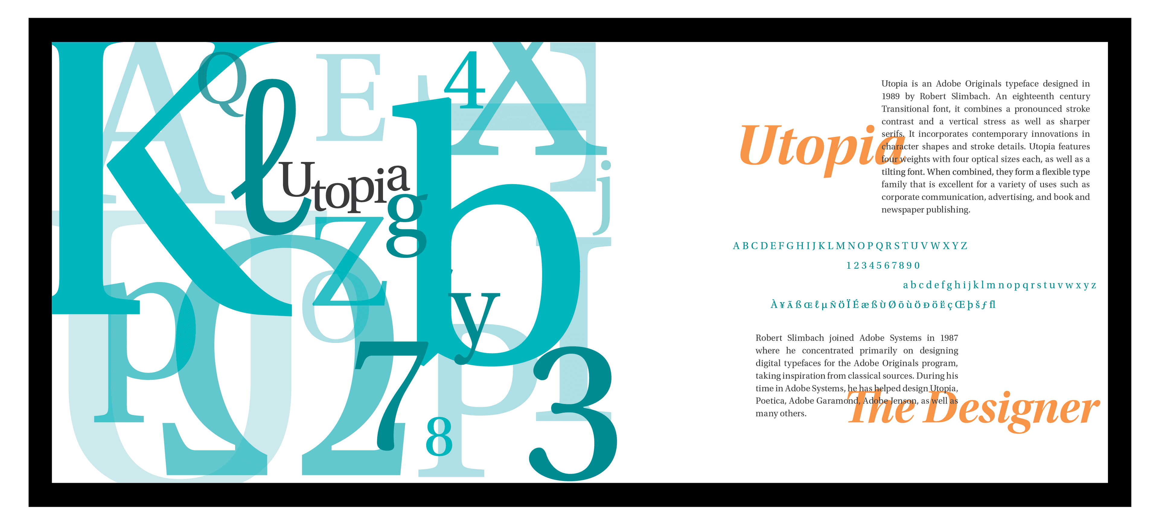
TYPE AS EDITORIAL
Editorial design projects which involved exploring different typefaces, their histories and classifications through reading and research. Each student chose two different typefaces to examine and create an editorial style spread. The purpose of the assignment was to gain experience using type and elements of design to enhance meaning and to develop an appreciation of type as letter forms in composition.


SUPERKIDS
This was a vitamin packaging project in which we had to research two different vitamin types, choose a theme, and design wrap around bottle labels for them. Using a bright and friendly color palette, and fun cartoon characters on the bottles, I wanted my target audience to respond with enthusiasm and an eagerness to give this product to their kids with trust, and to hopefully make it a little easier for their kids to take their vitamins.

CD RE-DESIGN
For this project we needed to take an existing Music CD that we felt could be improved with a redesign. Based on the style of the CD's musical theme and lyrics, I created a nautical theme design for the CD booklet and poster. I chose, The Rising Tide by Sunny Day Real Estate. We were required to create a CD booklet, inlay tray, spine, a CD disc graphic, and a concert poster.

HELLO DOLL!
For my senior project I created the identity and packaging for a fictitious company, Hello Doll! which specializes in bath and body products. The company's theme uses a fun and vintage design. I created three different patterns to represent the scents the company offers. The products I created included lotion, body spray, soap, and a sugar scrub.
